Table of Contents
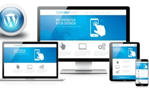
Web portals have become essential tools for businesses and organizations to interact with their users, customers, and stakeholders. These portals serve as gateways to information, services, and resources, making them critical components of a seamless online experience. With the increasing use of mobile devices, the importance and demand for mobile-responsive web portal development services have grown significantly.
Web portals are online platforms that combine various resources, services, and information into a single, easily accessible interface. They cater to a wide range of industries, including e-commerce, healthcare, education, finance, and more. Successful web portal development requires careful planning, user-centric design, and the use of appropriate technologies.
Web Portal Development: The Mobile Revolution
The rapid increase of smartphones and tablets has reshaped the digital landscape. People now rely on their mobile devices for a variety of tasks, from shopping and communication to research and entertainment. This shift in user behavior highlights the importance of ensuring that web portals are not just accessible but also optimized for mobile usage.
Benefits of a Mobile Responsive Web Portal
1. Accessibility across Devices
One of the primary benefits of mobile-responsive web portals is their ability to adapt to various screen sizes and resolutions. Whether users access the portal on a large desktop monitor, a laptop, a tablet, or a smartphone, a responsive design ensures that the content and functionality remain accessible and user-friendly.
2. Improved User Experience
User experience (UX) is a crucial factor in the success of any web portal. Mobile-responsive design enhances the overall user experience by providing an interface that is easy to navigate, regardless of the device. This leads to higher user satisfaction and increased engagement.
3. Increased Mobile Traffic
Mobile devices account for a significant portion of internet traffic. By having a mobile-responsive web portal, you tap into this extensive user base, potentially increasing your portal’s reach and user engagement. This is particularly important for businesses aiming to expand their online presence.
4. Enhanced SEO Performance
Search engines, such as Google, favor mobile-responsive websites and portals. They prioritize mobile-friendly content when delivering search results to users on mobile devices. Therefore, during the process of your web portal development, ensure the creation of a mobile-responsive portal as it can positively impact your search engine ranking and visibility.
5. Cost-Efficiency
Maintaining a separate mobile application or website can be costly and time-consuming. Mobile-responsive design eliminates the need for separate development efforts, saving resources and streamlining updates and maintenance.
6. Consistent Branding
Consistency in branding is vital for building trust and recognition. Mobile-responsive design ensures that your brand identity remains consistent across all devices, reinforcing your image and message.
7. Faster Load Times
Mobile users are often on the go and have limited patience for slow-loading websites. Mobile-responsive portals are optimized for speed and performance, reducing bounce rates and retaining users.
Further Advantages of Responsive Web Portals
1. Adaptability to Future Devices
The tech landscape is continually evolving, with new devices and screen sizes emerging. A mobile-responsive design is adaptable, ensuring that your portal remains accessible on future devices without the need for significant redevelopment.
2. Analytics and Data Insights
Mobile-responsive web portal development services often come equipped with analytics tools that provide valuable data on user behavior and preferences. This data can be used to make informed decisions, refine content, and improve user engagement.
3. Competitive Advantage
In a competitive digital landscape, offering a seamless mobile experience can set your portal apart from competitors. Users are more likely to choose a portal that caters to their device preferences and provides a hassle-free experience.
4. Integration with Mobile Features
Mobile-responsive web portals can take advantage of device-specific features such as GPS, cameras, and touch gestures. This opens up possibilities for innovative and interactive portal features.
5. Global Accessibility
Mobile devices are often the primary means of internet access in regions with limited infrastructure. A mobile-responsive portal can extend your reach to users in these areas. Therefore, contributing to global accessibility.
Challenges in Mobile-Responsive Design
While the benefits of mobile-responsive web portals are significant, it’s essential to be aware of potential challenges and considerations in the development process:
1. Content Prioritization: Determining which content to prioritize on smaller screens requires careful consideration. It may involve simplifying navigation and presenting essential information upfront.
2. Performance Optimization: During your web portal development process, ensuring fast load times and smooth performance on mobile devices can be challenging, especially when dealing with data-intensive portals.
3. Testing across Devices: Rigorous testing is necessary to ensure that the portal functions correctly and looks good on various mobile devices and browsers.
4. User Interface Adaptation: Designing a user interface (UI) that adapts seamlessly to different screen sizes and orientations requires expertise in responsive design principles.
5. Security: Mobile devices can pose unique security challenges. It’s crucial to implement strong security measures to protect user data and portal functionality.
Case Studies: Success Stories
To showcase the real-world impact of mobile-responsive web portals, let’s explore a few case studies of one of the best web portal development:
1. Amazon: Amazon’s mobile-responsive portal ensures that users can shop, view product details, and make purchases seamlessly on their smartphones and tablets, contributing to its global e-commerce dominance.
2. Wikipedia: Wikipedia’s mobile-responsive design provides a user-friendly experience for accessing vast amounts of information on various devices, making knowledge accessible to a worldwide audience.
3. LinkedIn LinkedIn’s mobile-responsive portal allows professionals to connect, network, and job hunt on the go, expanding its reach to a mobile-centric user base.
Measuring Success
Measuring the success of a mobile-responsive web portal involves monitoring various metrics:
1. Mobile Traffic: Analyze the percentage of traffic coming from mobile devices and track its growth over time.
2. Bounce Rate: Assess the bounce rate of mobile users. A lower bounce rate indicates that mobile visitors are engaging with your portal.
3. Conversion Rates: Measure the conversion rates of mobile users, such as sign-ups, purchases, or downloads.
4. Load Times: Monitor page load times on mobile devices to ensure optimal performance.
5. User Feedback: Gather user feedback through surveys, reviews, and user testing to identify areas for improvement.
Summing It All Up: Embracing Mobile-Responsive Design
Professional web portal development services offer a solution for businesses and organizations seeking to prosper in an increasingly digital landscape. As we conclude our exploration of these advantages, it’s crucial to emphasize the huge impact that mobile-responsive design can have on the success and relevance of web portals.
The reach of mobile devices knows no bounds. They have become universal, even in regions with limited internet infrastructure. By embracing mobile-responsive design, businesses can extend their global reach, connecting with users worldwide. This expanded accessibility not only broadens the user base but also contributes to the mission of making information and services available to a diverse global audience.
Technology evolves at a rapid pace. New devices, screen sizes, and interaction methods continually emerge. Mobile-responsive design, with its adaptability, future-proofs your web portal. You can confidently embrace emerging technologies without the need for significant redevelopment. This agility ensures that your portal remains relevant and accessible in the years to come.
In summary, mobile-responsive web portals represent a fundamental shift in web portal development. They prioritize user experience, accessibility, cost-efficiency, and adaptability, all of which contribute to a portal’s success in the digital era.
Whether you are a business aiming to expand your online presence, an educational institution seeking to engage students, or a healthcare provider improving patient experiences, mobile-responsive web portal design empowers you to connect with your audience effectively.
By recognizing the crucial role of mobile-responsive design and embracing its principles, businesses, and organizations unlock a world of opportunities. They not only strengthen their online presence but also build deeper connections with their users.